Theme Requirements
To run WordPress Theme we recommend using a host that supports:
PHP version 7.4 or greater.MySQL version 5 or greater OR MariaDB version 10.0 or greater.
We recommend you make sure that your server PHP configuration limits are as follows:
max_execution_time 600max_input_time 600memory_limit 256Mpost_max_size 128Mupload_max_filesize 128Mmax_input_vars 3000
Theme Installation
Step by step instructions for install WordPress Theme:
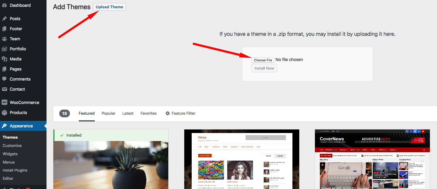
- Login to WordPress admin panel
- Go to: Appearance > Themes
- Click on the Add New button, then click on the Upload New
- Upload theme zip file
- Click on the Activate button
If you have some problem with this method please try another instalation way.
Supplementary link with description of theme installing via FTP or CPanel:
Plug-ins Installation
After completion of theme installation process at the top of the WordPress admin panel you should get a notice with the list of required and recommended plugins.

List of required plugins:
- Quere Core - theme core plugin (is required for using all custom modules, post-types, theme options and more other);
- WGL Extensions - theme plugin (includes all authors' extensions, functionality, features);
- Elementor Page Builder
List of recommended plugin:
- Contact Form 7 - plugin for easy create contact form
- Revolution Slider - plugin for create beautiful slides
- WooCommerce - use this plugin for your shop
List of required plugins for Real Estate feature:
- WGL Real Estate - use this plugin to have the Real Estate functinality
- MB Rest Api - adds Meta Box custom fields to WordPress Rest API (required for proper work of Real Estate functionality).
Child Theme
A WordPress child theme allows you to apply custom code changes to your site and dont lose it with update of main theme.
After theme installation, you can install child-theme. Please find it in the downloaded folder. You can same way install child theme as like parent theme.
Demo Content
Our Theme have One Click Demo Import
Please follow a few steps to make it:
- Go to WebGeniusLab > Demo Import
- Click on the Import Demo button
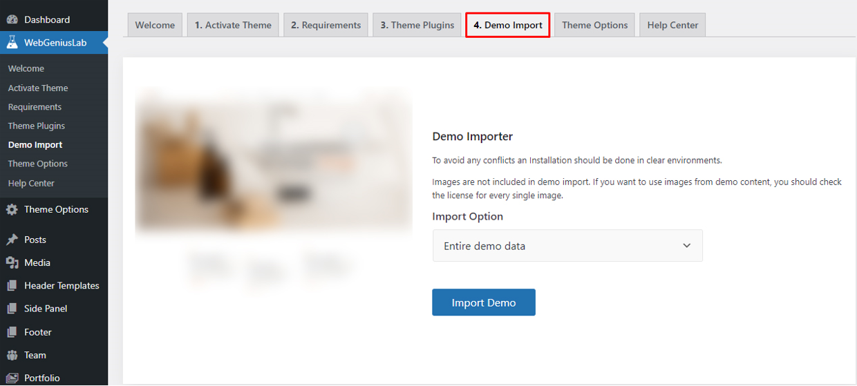
Import option:
- Entire demo data - import the entire demo content with all demo pages
- Partial - import only the required elements of the theme (certain pages, the demo settings of Theme Options, widgets)
Theme Options
Like a theme options panel in our product, we use Redux Framework. It is very easy to use.

In this panel you can customize fields like that:
- Use minify css/js
- Preloader (on/off, colors)
- Back to Top (on/of, colors, border)
- Custom JS
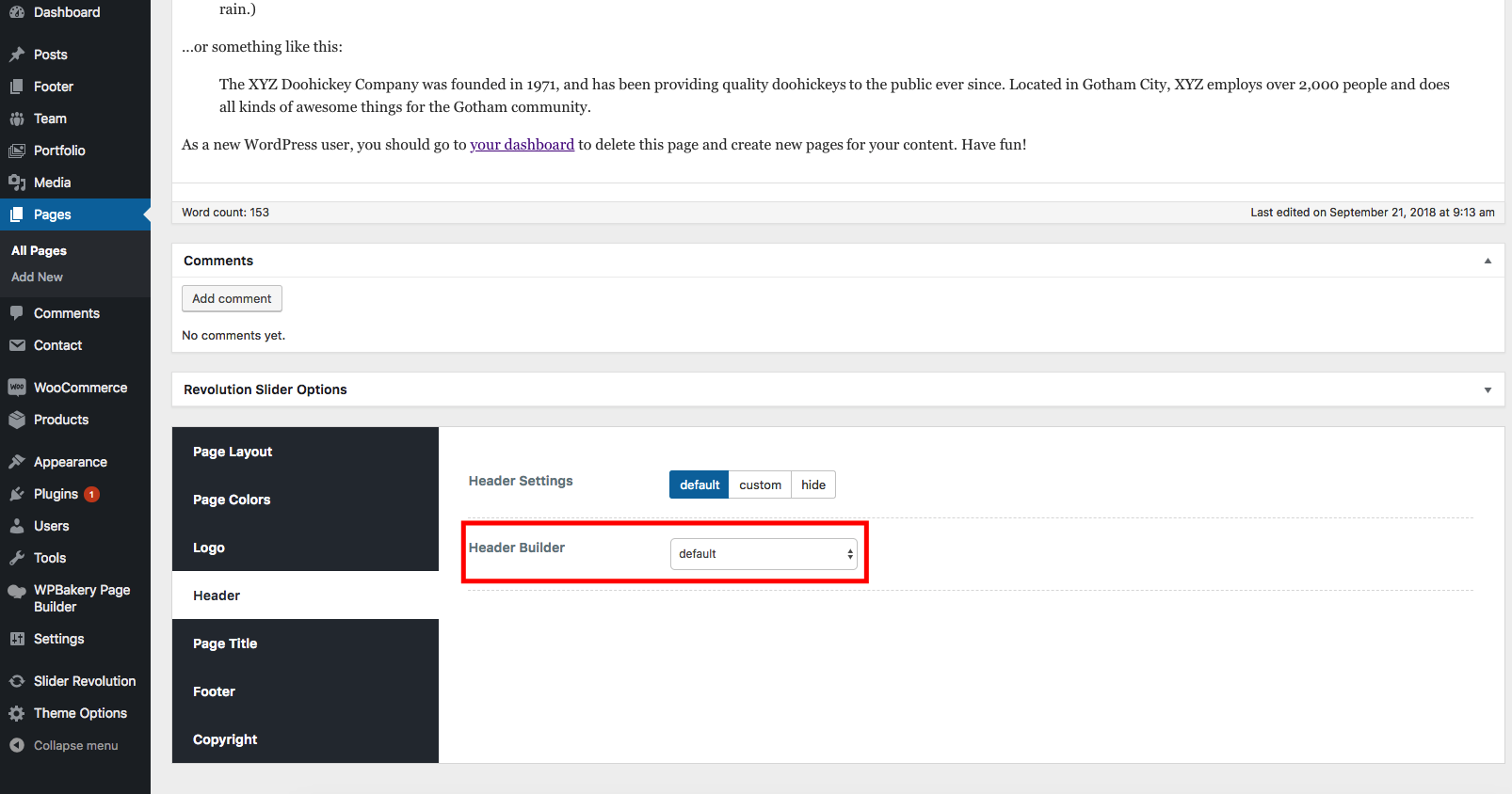
- Header
- Logo
- Header Builder with header preset and settings
- Sticky builder with settings
- Mobile builder with settings
- Page title
- Main layout settings for page title
- Typography page title
- Footer Settings
- Copyright
- Blog (single, archive)
- Portfolio (single, archive)
- Team (slug, title background)
- Page 404 (title background)
- Sidebars (Register sidebar, layout for page)
- Color Options (main theme color, body background)
- Typography
- Main content (content typography, headings main setting)
- Menu typography
- Heading typography (h1-h6)
- Shop
- Catalog (layout, page title, columns, product per page)
- Single (layout, page title)
- Related product (columns, count of items)
- Cart
- Checkout
- Demo Importer
- Import Export Theme Options config
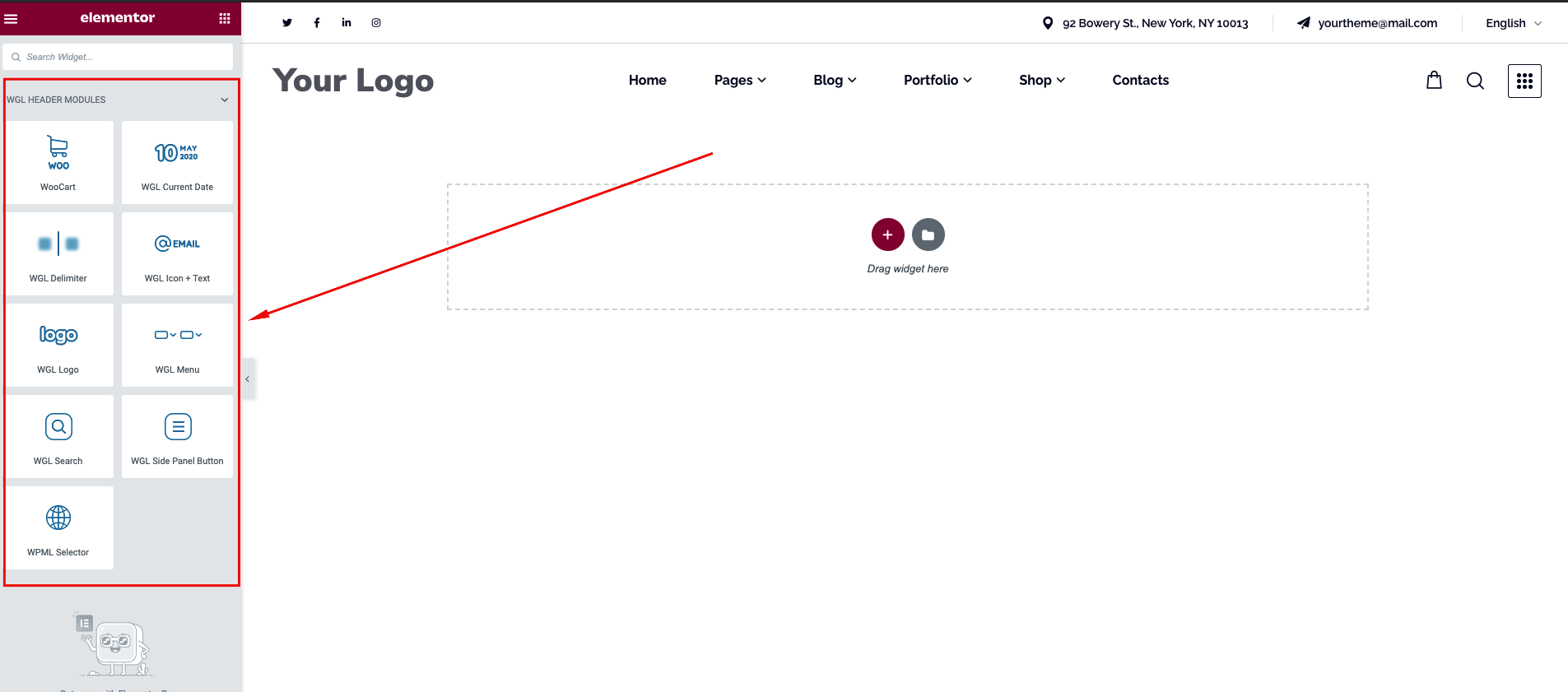
Header Builder
In our product for easy customize header we use own developed Drag&Drop Header Builder Powered By Elementor. With Header builder you can create "header templates", select one of these templates to apply globally or locally on the page.
We have created special modules for uses in the Header Templates: Logo, Menu, Current Date, Delimiter, Icon + Text, Search, Side Panel Button
Follow a few main rules for edit and apply Header Templates:
1. Select Header Template from the list or create a new one to get it active in Selector of Header Templates. This setting allows you to apply the Header Template for the whole site.
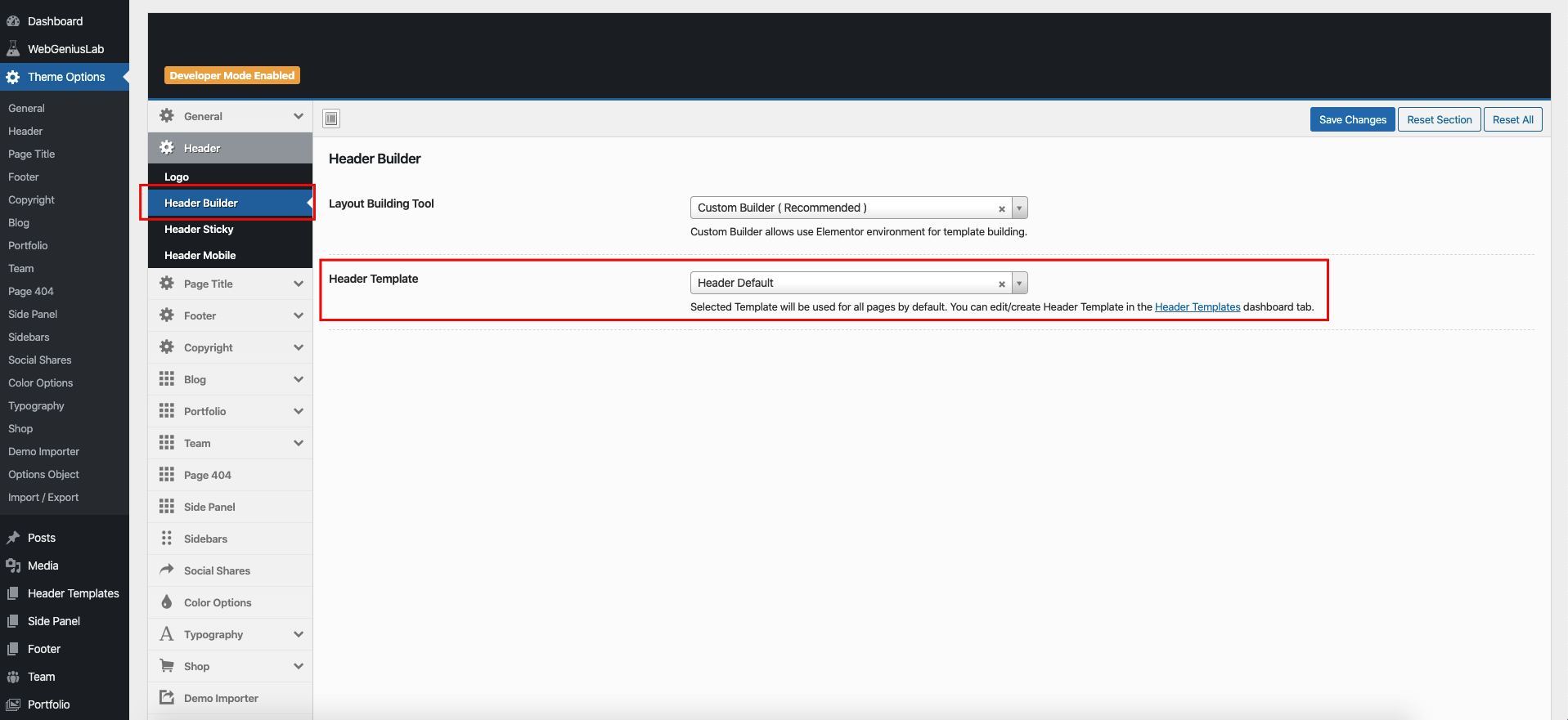
2. Go to the Header Templates for editing or creating a new one
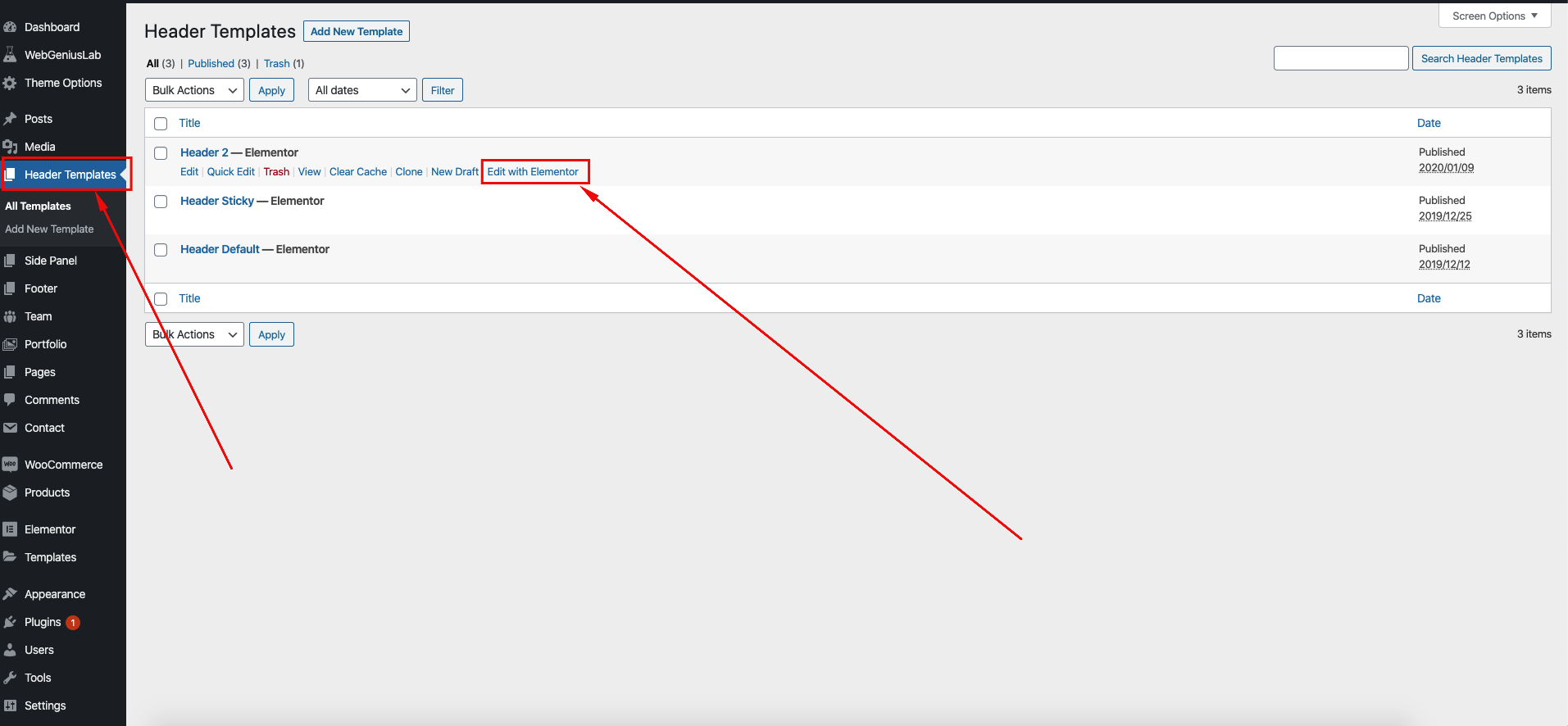
3. You have the possibility to select different Header Templates for each page at the Page Settings.
Mobile Header Builder
In order to manage the Mobile header, we provide the functionality for creating Custom Mobile Header.
Check the next instructions to manage the Mobile Header correctly:
First of all, you need to go to Theme Options > Header > Header Mobile and enable the Custom Mobile Header.

Below you can see available tools:
- Tools for managing the Appearance of the Header (the height, colors, sticky option and etc.)
- Tools for managing the Menu appearance (colors, position, custom menu)
- The elements which exist in the Mobile Header
- The elements which exist in the Mobile Drawer Panel

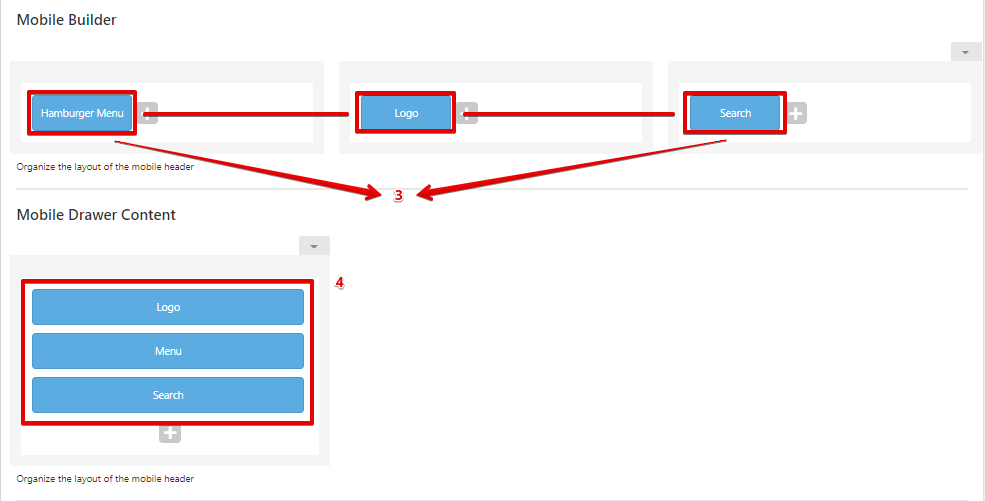
If you want to add any additional elements like: socials, buttons, Cart and etc. you need to click on the Plus icon and select require tool.

In order to manage or remove some element, you need to hover over the element and select the required option:

Page Builder and custom modules
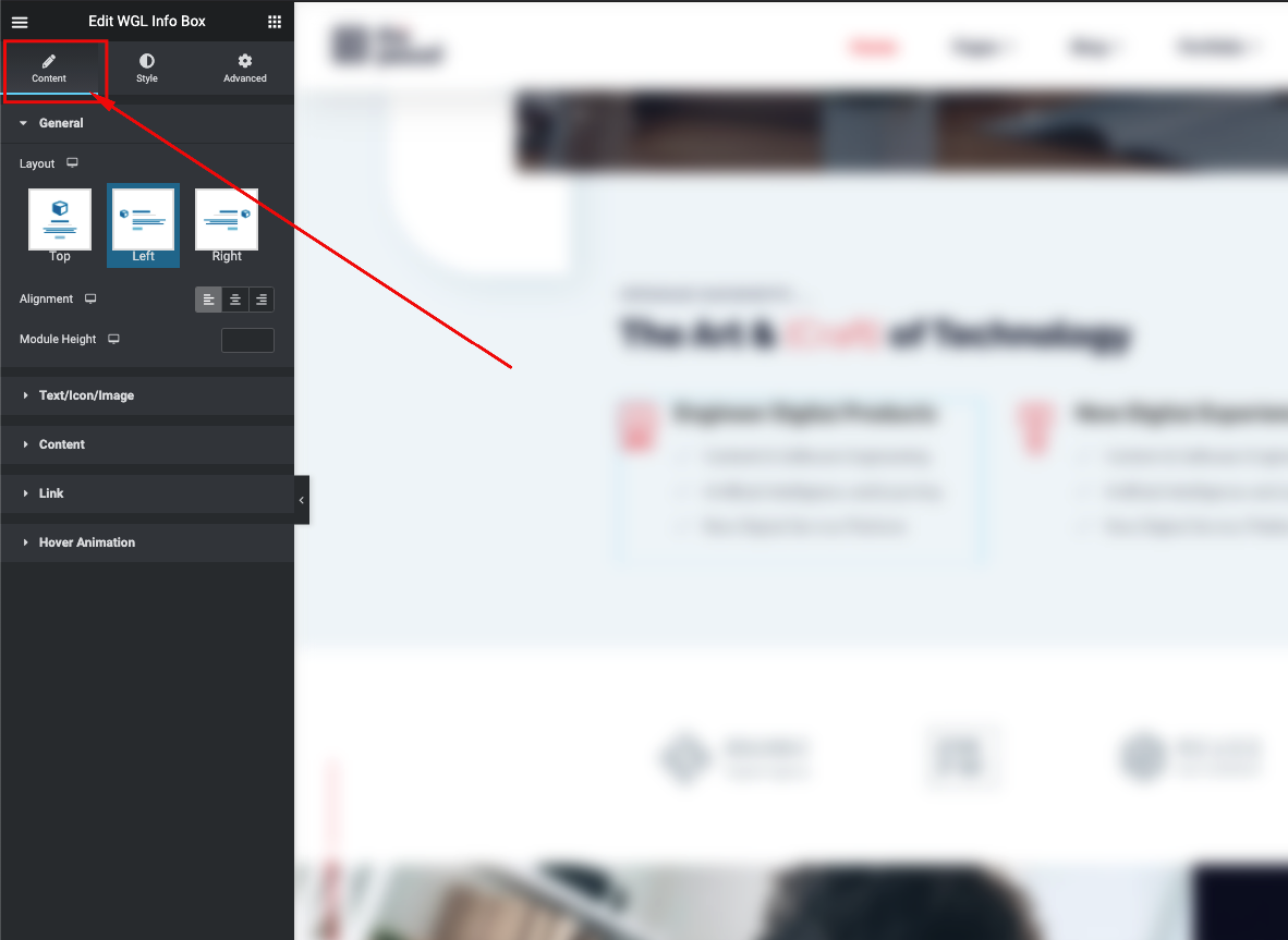
Our theme has a lot of flexible modules. You can use that with one of the best page builder (Elementor). Every module has a lot of options: size, color, alignment, styles types. This flexibility gives you a possibility built theme appropriate to your needs .
Every module has an icon which is a small visual presentation of the module.
"WGL Extended" is a group of very customizable modules developed by our team. Strongly recommended for use in our themes.

Every module has extended settings of colors, typography, alignment and queries:

List of content modules:
- Counter - display counter with title and description
- Carousel - use this module and rotate any modules
- Testimonials - module for display feedback from a client
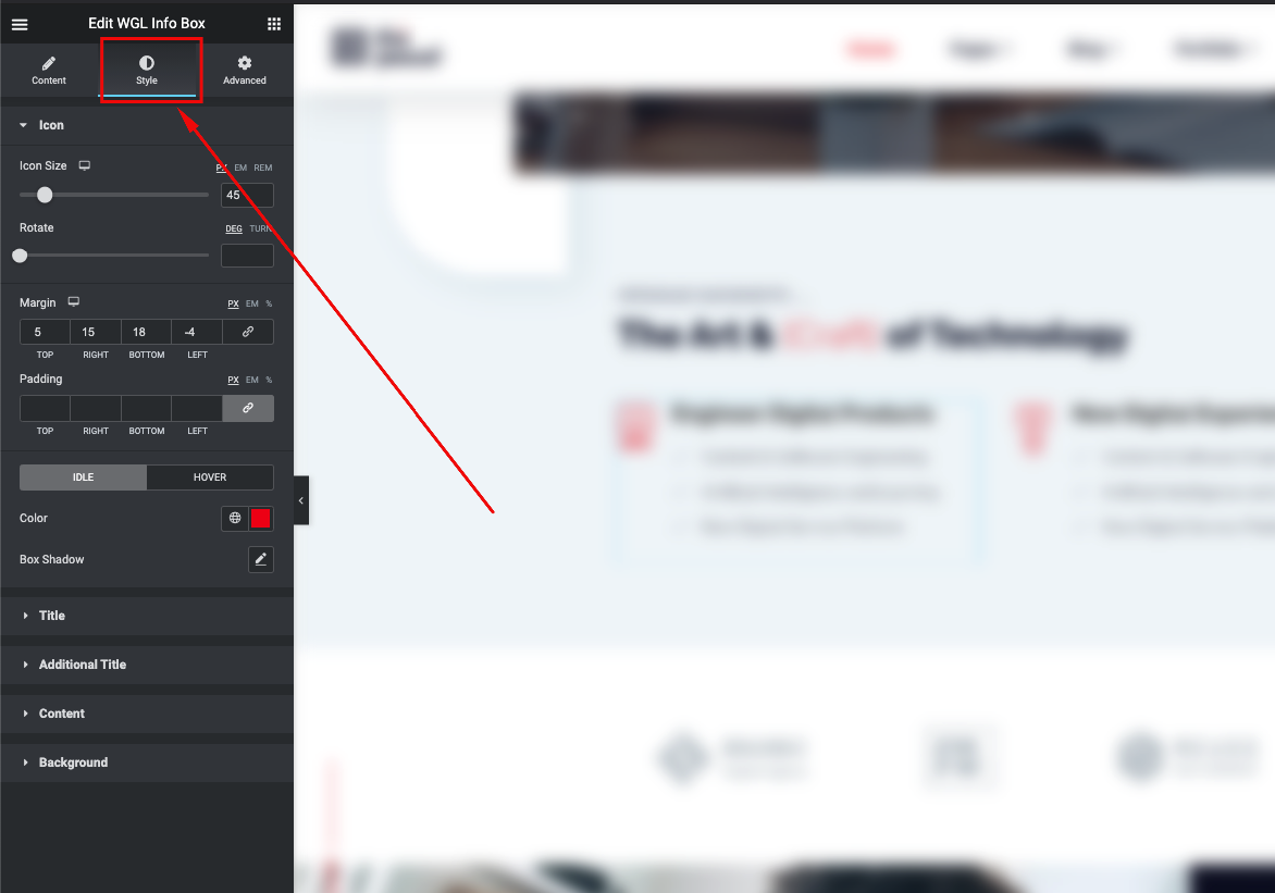
- Info Box - can be used for presentation beautiful info with icon, title, text and button which is linked to something
- Flip Box - similar to an Info Box module but animated with flip effect
- Image Layers - provides you the ability to create animated layered images
- Pricing Table - display your price policy with price table
- Button - one of the main content element with flexible style settings
- Double Headings - custom style of heading
- WGL Text Module - set your own styles and font-family on the text
- Countdown Timer - use this module as a countdown timer before your events occur
- Video Popup - display video within the popup in sace of user's click on the special button
- Clients - display logo of your clients with link and animation
- Social Icons - style social icons as you wish
- Time Line Vertical - display timeline of main events
- Progress Bar - display your skill with the percentage bar
- Portfolio List - show a grid of items with animation from Portfolio post-type
- Team List - show grid of items with animation from Team Members
- Accordion Service - present the info in stylish tabs with beautiful animation
- Blog - show a list of existing Blog posts
- Circuit Service - one more way to show the info in a sircle with hover animation
- Demo Item - display the demo of a certain item with Coming Soon option
- WGL Gallery - use this module to show your photos
- Image Animate - group the images and create beautiful animation by yourself
- Image Comparison - let you to display images in comparison like before\after
- Image HotSpots - highlight the important items putting the hot spots
- Pie Chart - display the circular statistical graphic
- Products Grid - display all available products in one of existing styles: grid, list, carousel
- Satellite Service - display the info with icon and astonishing animation around it
- Service - strict stylish way to present the information with icon, title, image and links
- Tabs - show the tabs in a stylish layout
- Toggle/Accordion - create the list with the toggle function
- Working Hours - display your working hours
- WGL Login - add the button with a login option
- WGL Contact Form 7 - provides the ability to style the form without CSS
- Instagram - immitates the Intagram carousel, displays the posts
- Rotated Text - allows to put rotated text along the left side
- Showcase - showcase the elements before redirecting to the page
- Link Overlay - attach the link to the entire row\column or elements which don't contain the link option
Extended Animation and Features
These options are intended to create a stylish background animation and to add some specific features.
All Extended Row Animation and Features are available in the "Style" area of the editing Elementor section.
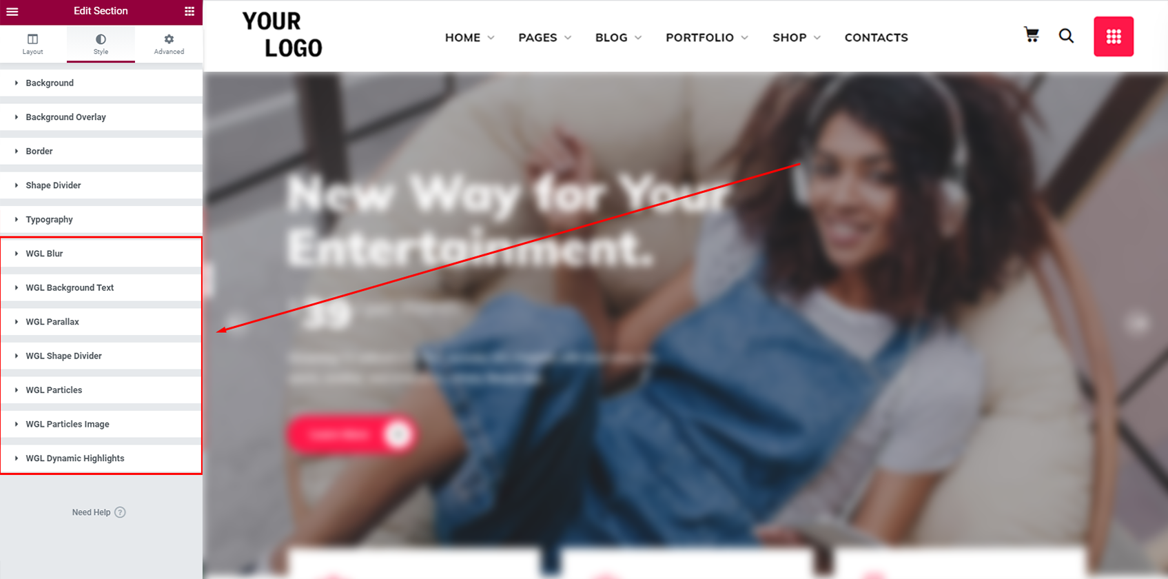
Every tool has its specific features:


List of extended row animation and features
- WGL Blur - allows you to blur the background of the section under another content
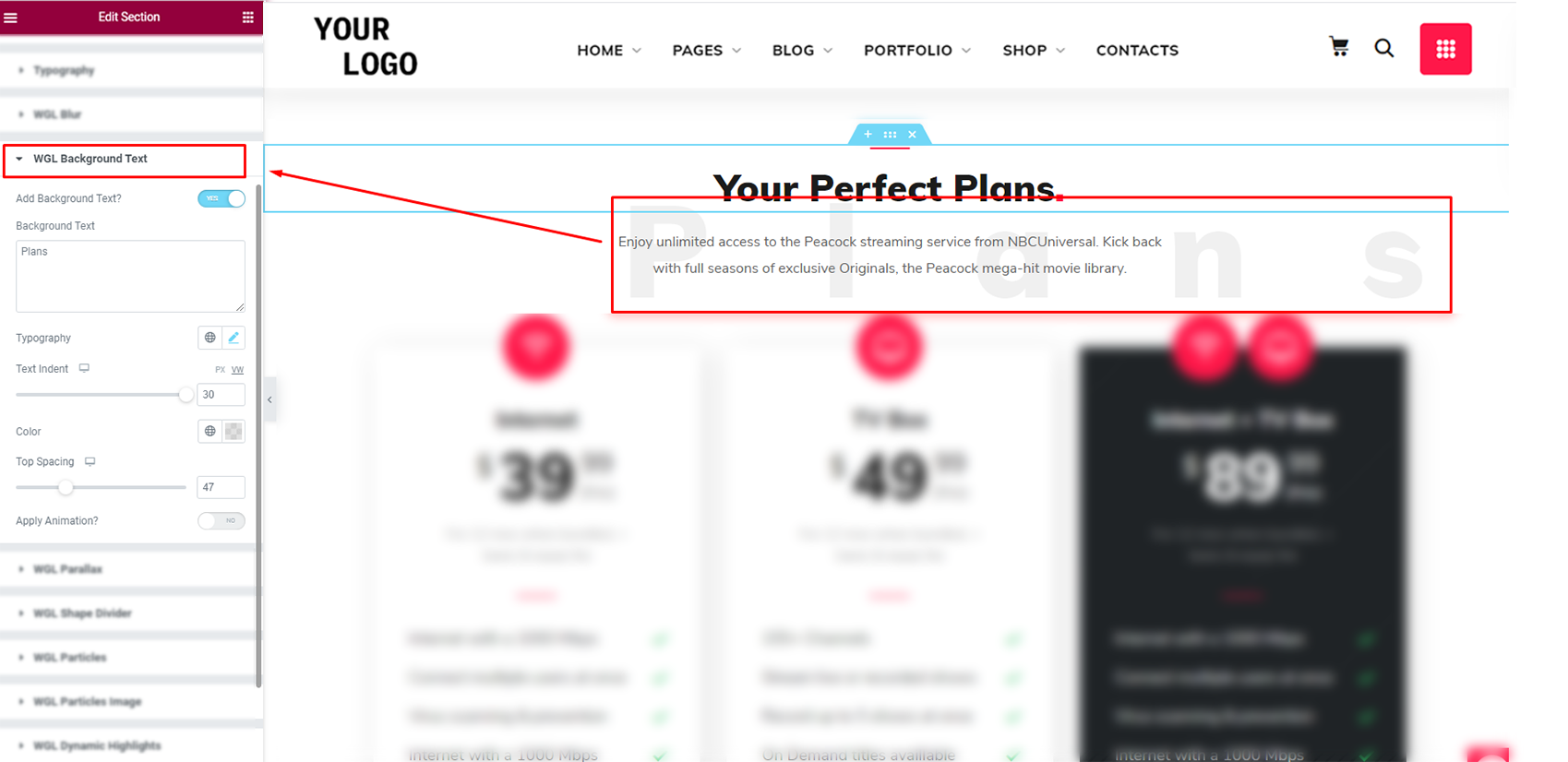
- WGL Background Text - use this feature to pay attention to the required section
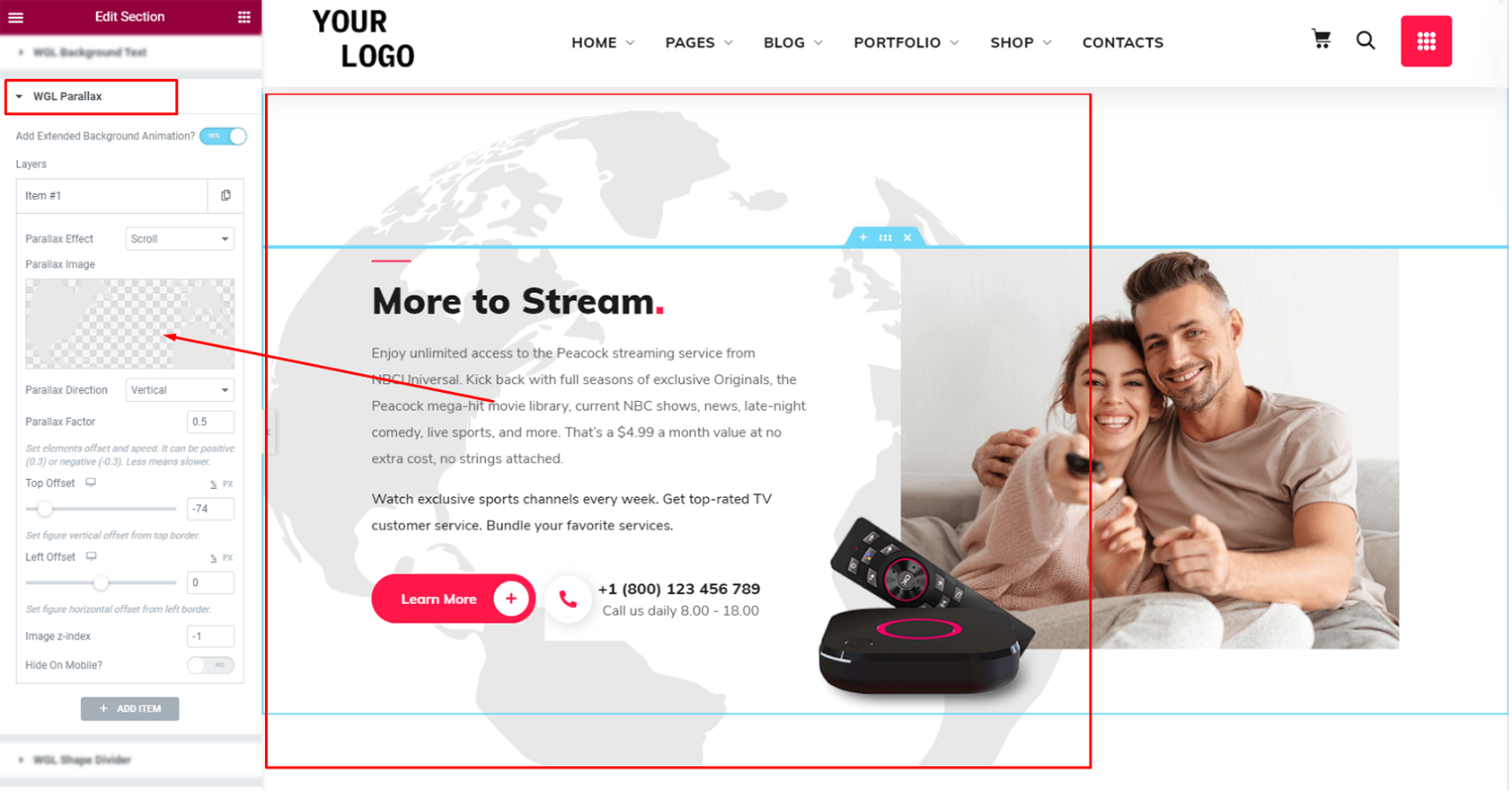
- WGL Parallax - add a parallax effect to the background
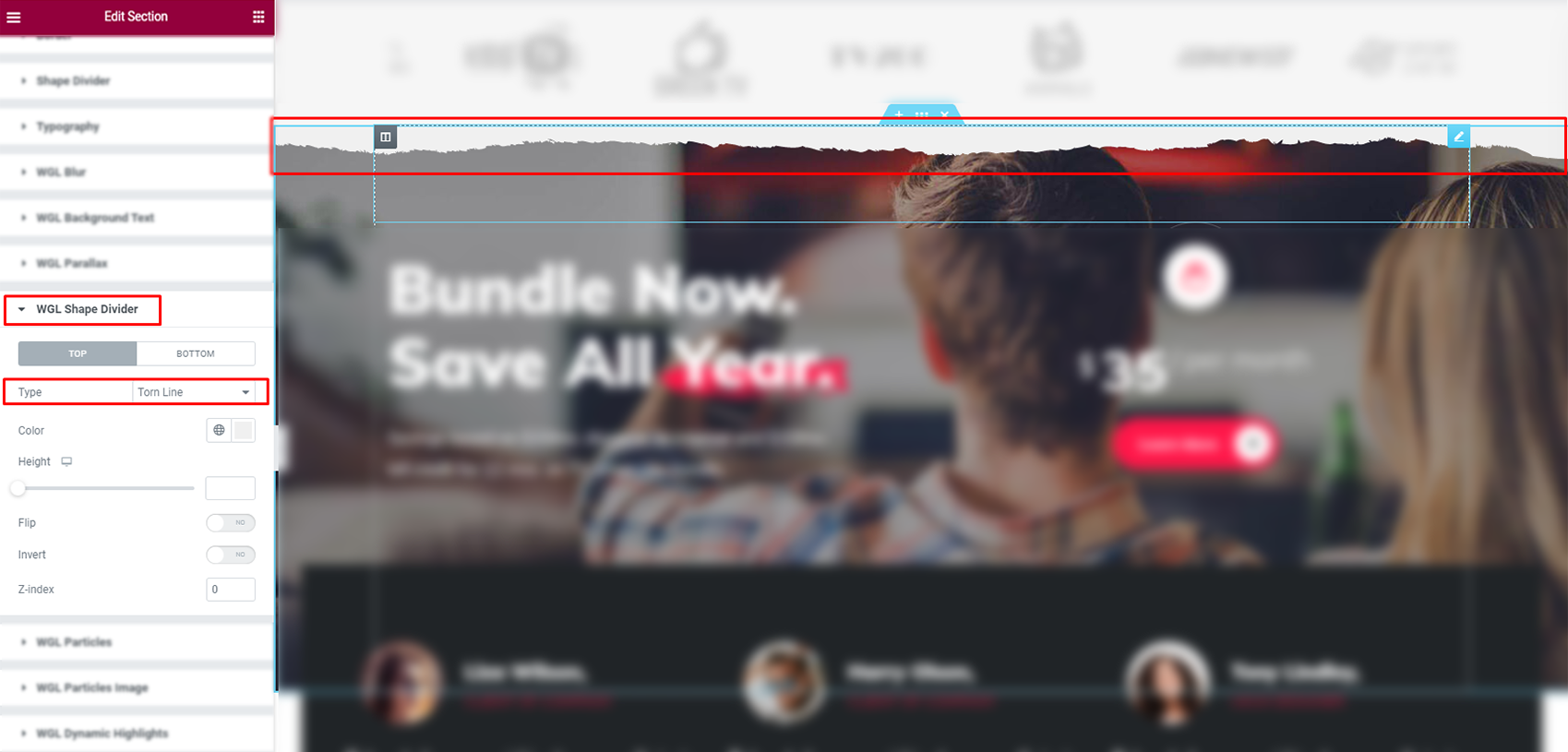
- WGL Shape Devider - use this tool to add the effect of torn line
- WGL Particles - add animation of soaring balls
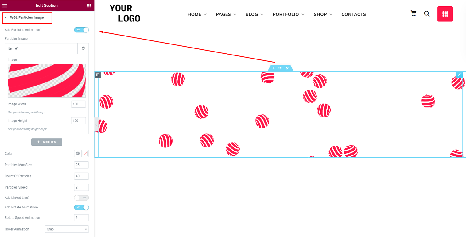
- WGL Particles Image - add the soaring animation of the custom images
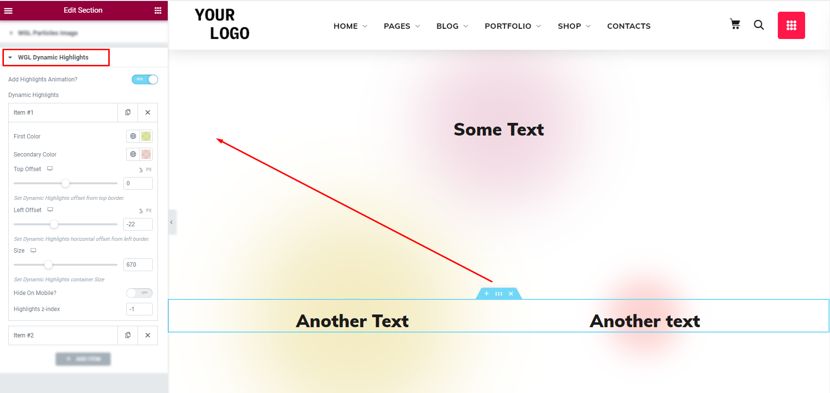
- WGL Dynamic Highlights - put the colorful animated spotlight behind the text\image with the ability of dynamic color change scrolling the page
Background animation and features
- WGL Fluid Animation - adds the fluid background animation, which appears with the cursor movement (includes the ability to manage the colors, diffusion, and size of the animation).
If you want to use the WGL Fluid Animation tool, you need to enable the animation in the Page Settings via the Elementor editor.

The fluids appear on the entire page at once, where was not set the background. (if somewhere you don't want to use the animation, you need to add the background color or image)
- Keys press sensitivity - press the following buttons on the keyboard in order to see additional scroll animation features:

- P-pause - allows drawing with the help of the cursor. After the second press on the button, the animation will diffuse
- Space - press this button scrolling the page. The background of the entire page will be fully animated
Button animation
- WGL Button contains the ability to enable the Fluid animation with a click.
Before using this option, please, make sure the WGL Fluid Animation was enable for the page.

You can enable this option, in Style > Animation section of the WGL Button module
List of extra features
There are some extra features available on the theme:
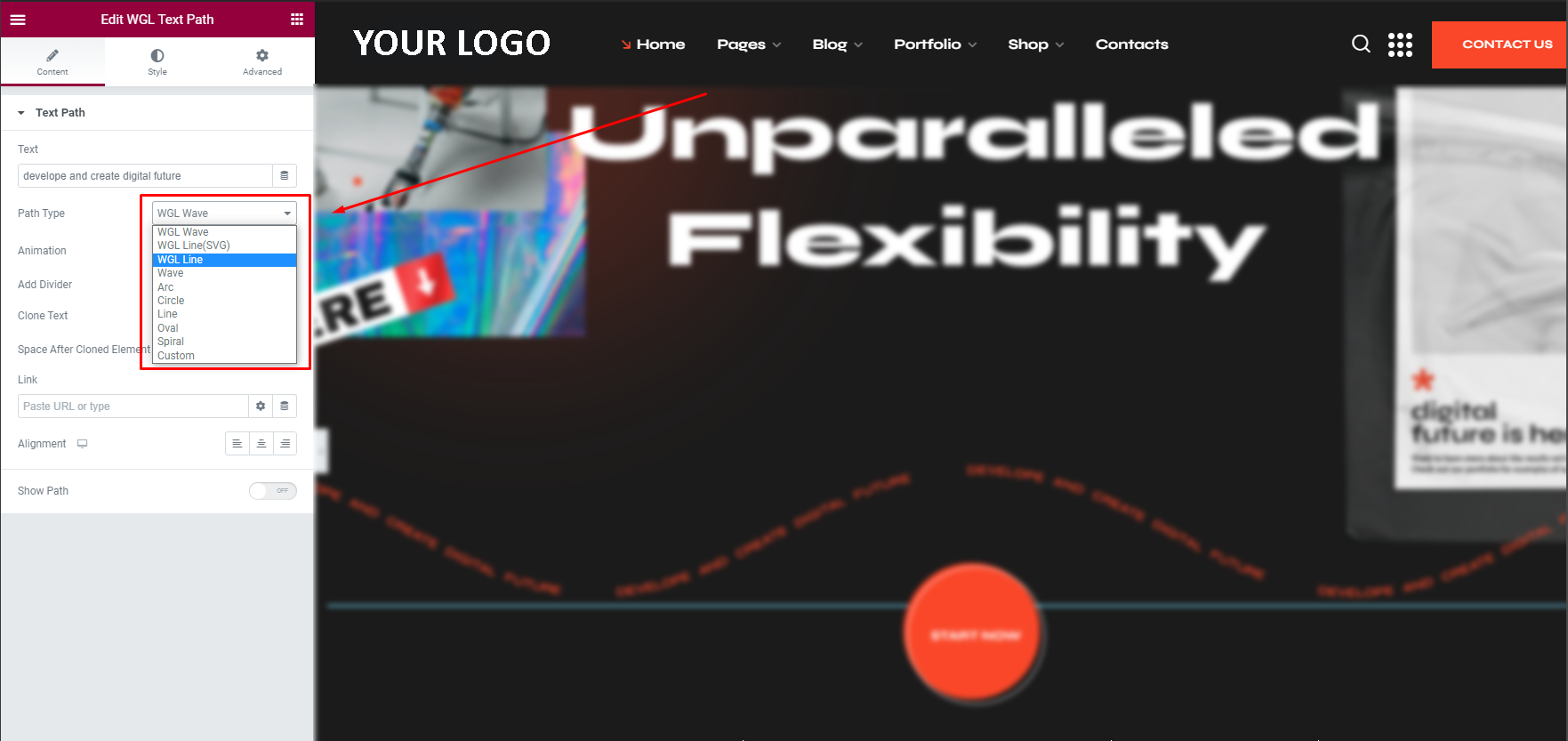
- WGL Text path module - intended to create animated text line. Contains a few layouts. Could be animated with scrolling through the page or in an infinite loop.
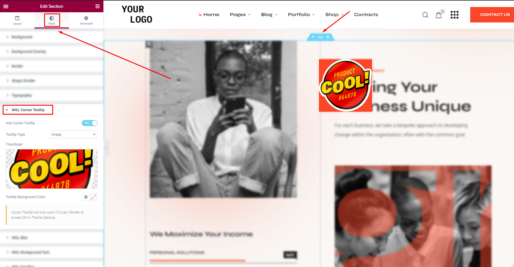
- Cursor Tooltip feature - provides the ability to set a custom Cursor Tooltip. Could be set for a certain element separately as an additional option (WGL Button, WGL Doule Heading, WGL Portfolio, WGL Team, WGL Info Box, WGL Service, WGL Showcase) or for an entire section at once.
As a tooltip, you can set a custom image, custom text, or default text. - Properties Grid
- List of Properties
- Dynamic Map with popups
- General - price and measurement settings.
- Google Settings - area for Google API Key (generate your personal API key to manage the map) and the Map styles.
- Page Title - manage Page Title settings (image, breadcrumbs, height, alignment) for the Desktop.
- Responsive Page Title - manage Page Title settings (paddings, height, font-size) for the responsive.
- Archive - appearance settings. Also, it contains the ability to manage the filters (select for which values it will be filtered).
- Single - basic appearance settings (BG image, paddings, on\off meta).
- Related - related posts options.
- Filter Settings - here you can find the filter based on ReactJS:
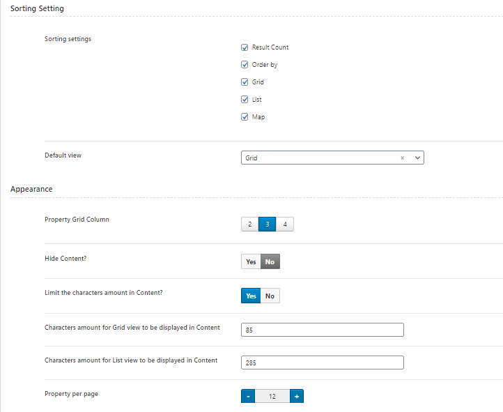
- Sorting Settings- select sorting and type of view.
- Appearance - manage the layout: amount of columns, number of values,visibility of content and etc.
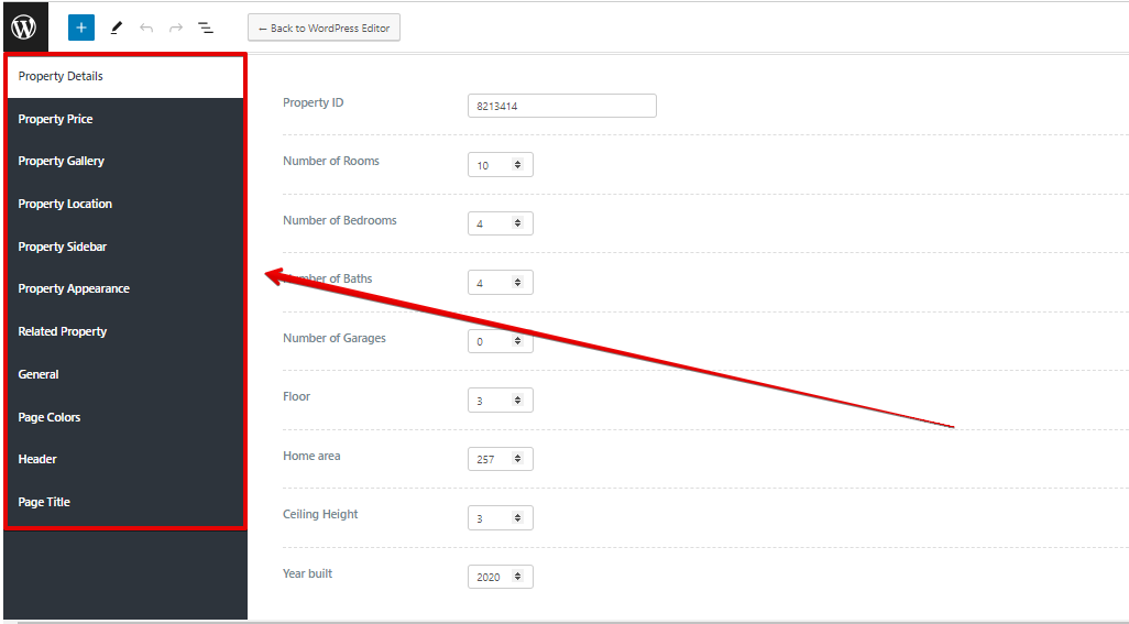
- Property Details - provides the ability to manage the property values (number of rooms, floor, etc).
- Property Price - set price and individual values for the currency.
- Property Gallery - add additional images of the property.
- Property Location - manage individual location.
- Property Sidebar - set sidebar with individual information for a certain post.
- Property Appearance - manage post-meta information.
- Related property - manage the related posts for individual algorithms.
- General - body styles.
- Page Colors - manage the colors for every page separately.
- Page Header - set individual Header.
- Page Title - disable Page Title or set idividual image for a certain post.
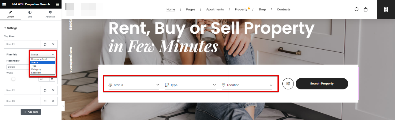
- Top Filter - add the values for filtering by: status, type, category, location;
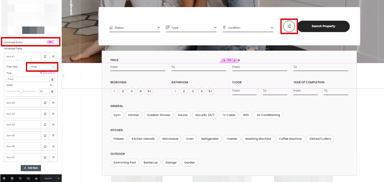
- Advanced Fields - enable advanced button to get the additional field for filtering;
- Review Property Before Publishing or publish the Property post immediately;
- Review Property After Editing or publish the changes without verification.

Mega Menu
Mega Menu is a drop-down panel of the content, which is displayed below a header. It makes all the required information\options visible at once.

In this theme, Mega Menu could be created with the help of Elementor Templates. It provides the ability to add any content, like it could be done on simple pages.
1. Go to your dashboard > Templates > Saved Templates > WGL Mega Menu. There you can edit the existing templates or create a new one.

2. After the successful creation of the templates for the Mega Menu, you need to enable the Mega Menu option. Go to Appearance > Menus > select the required Parent menu page and enable the menu option with Elementor Builder

3. Below select the required template among pre-made templates.

4. Don't forget to set the position of the menu under the Menu elements and the width of the Mega Menu content box.Don't make the content box very small, it will break the structure!

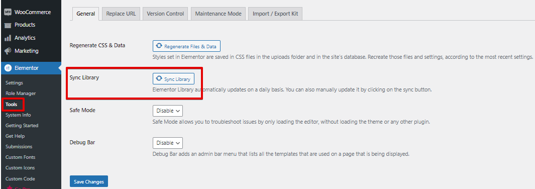
*If after making changes in the templates, the Mega Menu style is broken, you need to synchronize the library in Elementor > Tools:
WGL Real Estate (Properties)
The Properties tool provides the ability to display spaces for rent/sale, with all required equipment. WGL Real Estate plugin is responsible for these features. The plugin comes bundled with the theme.
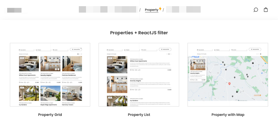
The Properties have three types of layouts that will fit any requirements. There are three types of layouts powered with ReactJS:
The Prorepties tool could be managed in the same way as other post-types: in Theme Options - default settings for all items, and in Property details - for individual configuration of every item.
General properties settings in the Theme Options:

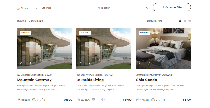
Archive + ReactJS Filter
In Theme Options > Properties > Archive you can manage the layout of the Properties Archive page (storage of all posts). There are available options for managing filters, sorting and appearance settings.
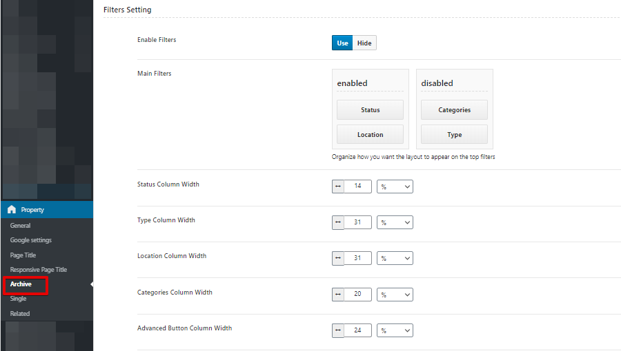


The Filters have some main values like: type, categories, location, status. If you don't want to filter by some value, you just need to move it to the next disabled column. Also, here you can manage the column width.
Single Property
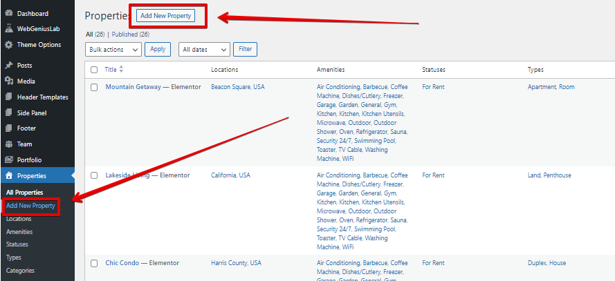
In order to create a new Property item you need to go to your dashboard > Properties > Add New Property:
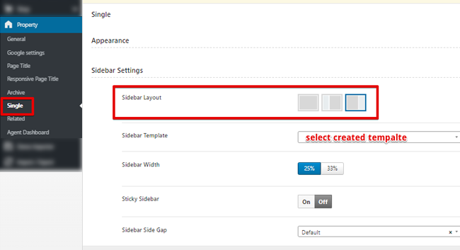
The global settings for the Single Properties could be found inside the Theme Options > Property > Single. Inside the Property details there are a bulk of individual options for every property item.
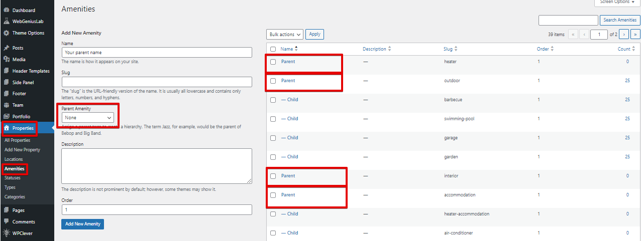
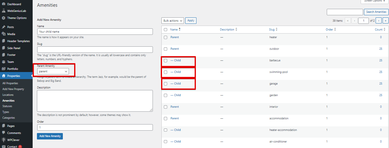
All items for filtering by certain requirements, should be added inside your dashboard > Properties > Categories/Types/Status/Amenities/Locations > Add New.
Every Single property contains the Amenities section. It collects child elements into groups of parent elements.
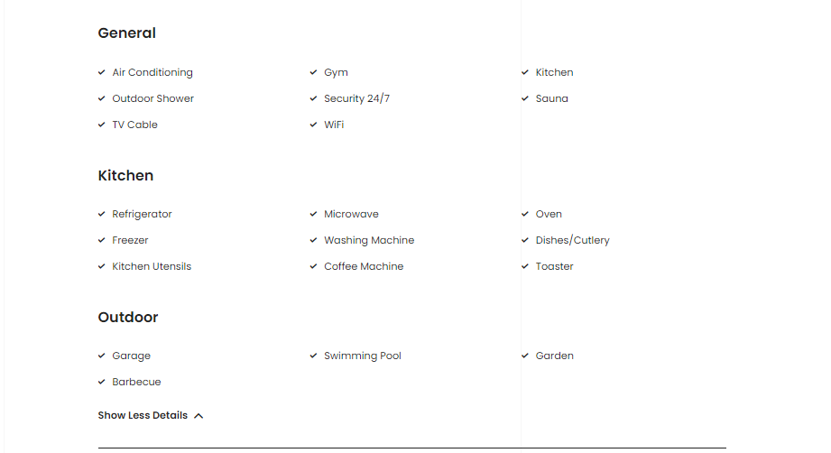
The Amenities could be added inside your dashboard > Properties > Amenities. To create a similar group with sub-elements you need to create some kind of hierarchy.

In order to get a"title" you need to create the parent element:
For creating "sub-elements" should be created the child elements by selecting the parent Amenity:
To display an Agent's personal information in the SideBar, add the WGL Agent Property widget under Appearance > Widgets:
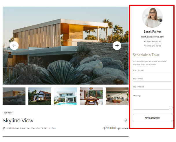

and this Sidebar should be select in Theme Options > Property > Single:
Properties modules for Elementor
The WGL Properties Search provides the ability to filter the Property posts.
The WGL Property - module for displaying all existing properties in Grid layout.

Agent (realtor) dashboard
The WGL Real Estate plugin offers the ability to register the agents (realtors) and publish the Properties without accessing the dashboard.
Firstly, the main site admin should prepare the dashboard for agents work.
1. Create a new empty page and then go to Theme Options > Property > Agent Dashboard and select there newly created page for the Agent Dashboard


In the same area, could be managed the Agent's Permissions:
2. Add the WGL Profile module to a Header Template:

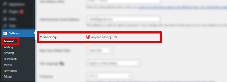
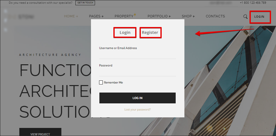
3. Please, make sure the option "Anyone can register" is enabled inside your dashboard > Settings > General:
4. The Agent's Profile fields should be filled in with the correct personal information to be automatically applied to the SideBar content (that can be added and managed as described in the documentation above):
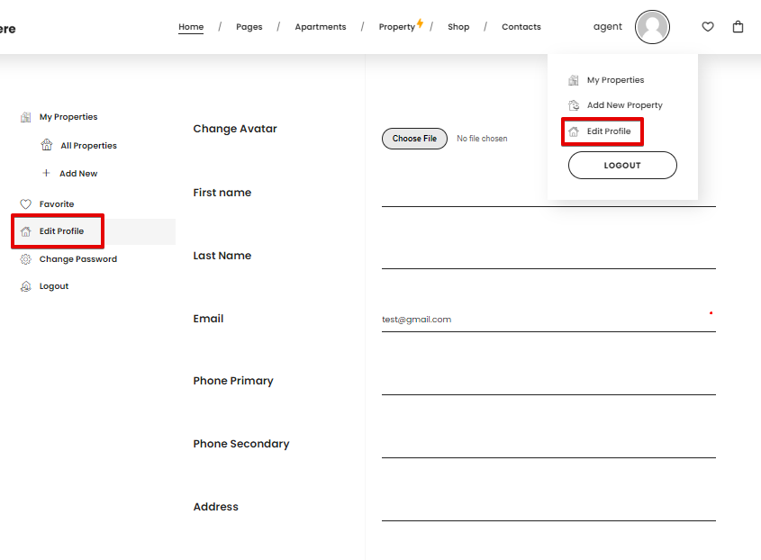
After completing these steps, an agent can log in or register and gain the ability to manage their profile and add new properties.

Support
If you did not find an answer to your question, please feel free to contact us.
Support Forum: - webgeniuslab.ticksy.com
Email: - webgeniuslab@gmail.com
ThemeForest Account: - WebGeniusLab